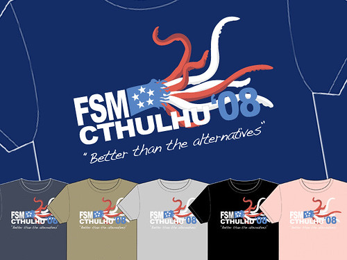
Well, I was inspired by that to make these:
Well, it's not my best work. Let's leave it at that.
...
OK, let's not leave it at that. Here are the things wrong with the graphic:
First, I'm using the following two source images:


Now, first off, I should have looked harder for a Cthulhu image. This one is ... kind of blurry. Which is not a good starting place. But I had FSM reaching out left and Cthulhu reaching out right (or perhaps dropping a guy?)... too good to pass up.
But then, I combined them into this image:

There are a number of problems with this image. Who can spot one of the major ones?
Here's a hint: Look at Cthulhu's head.
Hint #2: Look at the crack.
The crack stops at his head! What what what? If this is supposed to be a painting, HOW does the crack mysteriously stop right at his head?
Of course the answer is that I pasted Cthulhu over the original image. And I'm lazy. And I didn't notice. So there it is.
*UPDATE*
Well, of course, I couldn't let it stand at that, now could I? ^_^ I found a better Cthulhu image:

AND learned about color matching. And learned new tricks for transparent layers. So, the updated version is:

There are still problems (there always are). Look at the buildings/rocks in the bottom right. Yeah, that's all messed up. But overall, I think it looks much better now. ^_^
Now I just need a campaign slogan....